The name remains the same. And we still have the same mission: Improving human and planetary health. But we keep on renewing ourselves to get ready for the future.
Now one central element changes: Our logo.
Play the video below to see the animated new design.
The arrowhead
After more than a year long process of step-by-step implementation of a new visual identity in different channels and in our product families, this is the last piece of our rebranding puzzle. The new logo completes the picture, and is now the arrowhead of a consistent global profile.
The logo icon is open, clean and simple – just the way we want to express our core values. These principles run through the whole value chain, from our sustainable harvesting operations in the Antarctica to how we want our customers to experience working with us.

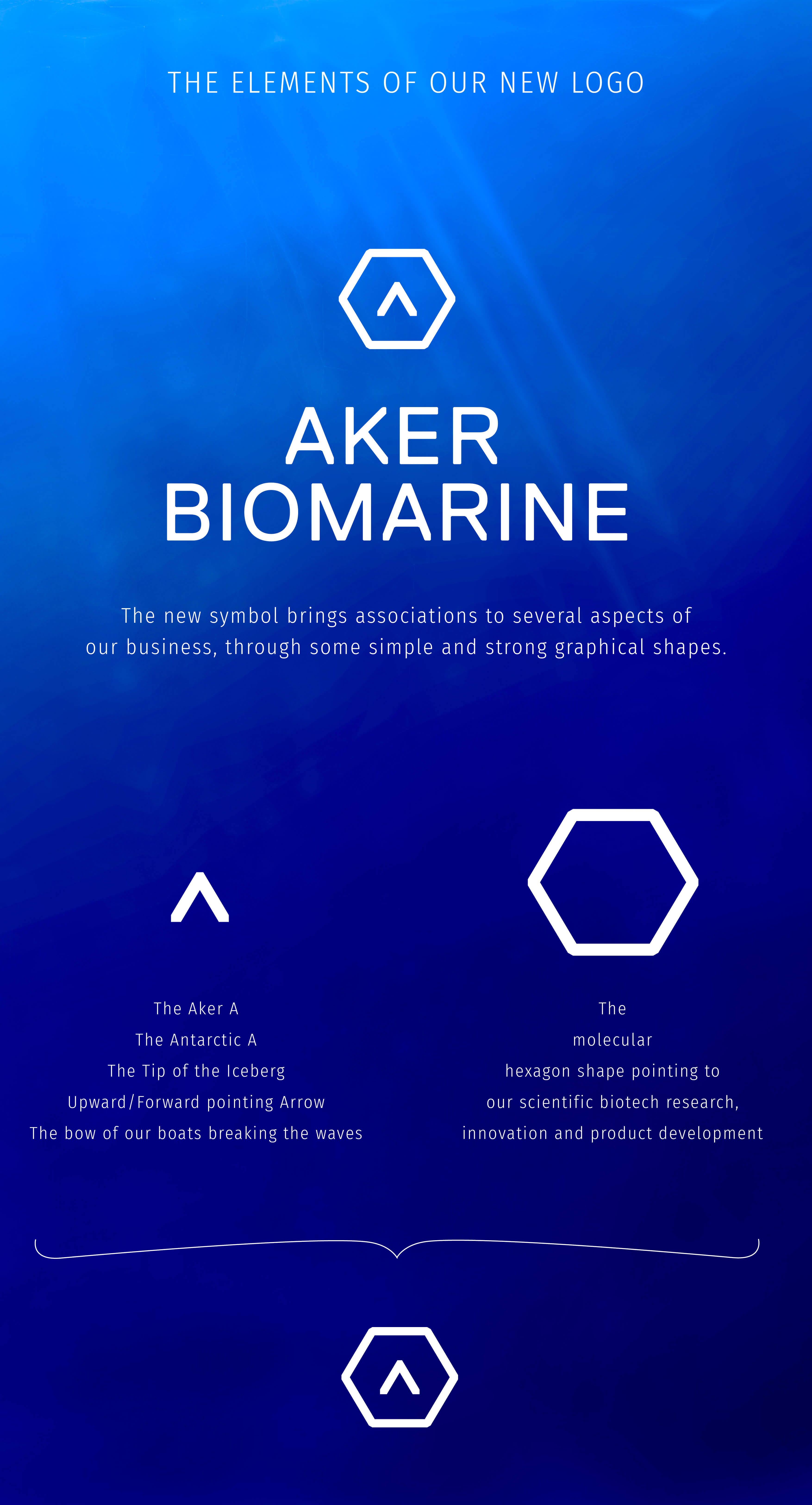
The incorporated messages
Several aspects of our operations are "hidden" in the simple geometric shapes:
- The A in Aker, bringing with us the heritage from our mother company.
- The A in Antarctic, where we harvest the krill.
- The upward and forward pointing arrow, as we are always searching for new opportunities.
- The bow of our vessels breaking the waves.
And:
- The molecular hexagon shape points towards our scientific biotech research, innovation and product development.

The new logo was launched the same day as the naming ceremony of our new unique krill vessel, January 18th 2019.
Now, as the new logo shines on polished steel on the stern of "Antarctic Endurance”, it signals the start of a new chapter for Aker BioMarine.
We are ready for new adventures, continuing to search for the extraordinary, better equipped than ever before.
Hope you’ll join us on the ride!
.jpg?width=1684&name=aker-biomarine%20logoplakat%20(1).jpg)
